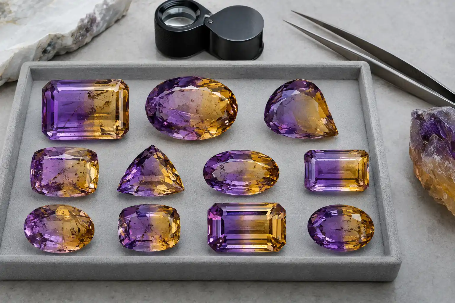
Ametrine Quality Grading: 8 Key Signs of Exceptional Color Zoning
Ametrine quality grading begins with the relationship between its two colors. Fine ametrine should display recognizable violet amethyst and yellow to golden citrine in the same quartz crystal, with both colors sufficiently saturated to remain attractive on their own and sufficiently separated to create an obvious bicolor effect. The highest-quality stones usually combine strong zoning with eye-clean transparency, good brightness, effective cut orientation, balanced proportions, and natural origin.
There is no single internationally standardized ametrine grading scale equivalent to formal diamond grading. Terms such as AAA, premium, top color, Bolivian quality, or collector grade may be defined differently by individual sellers. For that reason, buyers should grade what they can actually observe: purple quality, yellow quality, boundary definition, balance, transparency, brilliance, size, origin, and treatment status.
Ametrine belongs to the quartz family and has the same basic chemical composition, SiO₂, as amethyst and citrine. The bicolor appearance results from different color-producing conditions in separate sectors of one crystal. Cutting then determines whether those natural sectors appear as a clean split, a diagonal division, a checkerboard interaction, or a weak blend. This makes lapidary orientation unusually important in ametrine grading.
8 Key Signs of Exceptional Ametrine Color Zoning
- Clearly identifiable amethyst and citrine colors
- Strong saturation in both color regions
- A clean and visually distinct color boundary
- Balanced distribution of violet and yellow
- Minimal distracting colorless or muddy zones
- Eye-clean transparency and strong brilliance
- Cut orientation that displays both colors effectively
- Verified natural origin with appropriate treatment disclosure
These eight characteristics create a practical grading structure. Ametrine does not need a perfectly straight fifty-fifty split to be exceptional, but both colors should contribute meaningfully to the finished design.
1. Fine Ametrine Must Show Two Clearly Identifiable Colors
The first question is simple: can the viewer immediately recognize both amethyst and citrine?
The violet zone should read clearly as purple rather than gray, brown, or nearly colorless quartz. The citrine zone should appear distinctly yellow, golden yellow, honey, or orange-yellow rather than merely being a slightly warmer transparent region.
Weak bicolor gems may show enough variation to qualify technically as ametrine while failing to create a strong visual effect. Fine quality requires more than laboratory identification. The difference between the two zones should be aesthetically obvious.
Lighting matters, so grading should occur under neutral daylight-equivalent illumination before moving to warmer indoor light. Yellow can appear richer under warm illumination, while violet may change in apparent saturation depending on the spectrum of the lamp.
The stone should remain recognizably bicolor across several realistic lighting environments rather than showing its best separation under only one highly flattering source.
2. Both the Violet and Yellow Zones Need Strong Saturation
Ametrine is only as compelling as its weaker color. A vivid purple half paired with nearly colorless yellow usually produces an unbalanced impression, just as strong golden citrine with barely visible lavender weakens the bicolor identity.
Fine amethyst coloration typically benefits from medium to strong purple saturation with enough brightness to avoid black-looking extinction. Red or blue secondary impressions can both be attractive when the stone remains recognizably violet.
The citrine portion should have enough yellow or golden saturation to contrast with purple. Very pale yellow can disappear against skin, metal, or bright backgrounds.
Tone needs balance in both zones. Extremely dark purple beside bright yellow can make one side look heavy, while dark brownish orange may reduce the freshness of the citrine region.
An exceptional stone gives both halves visual authority. The eye should move between two attractive colors rather than treating one as the center and the other as an accidental patch.
3. Boundary Definition Is Central to Ametrine Quality
The transition between violet and yellow can be sharp, angular, diagonal, irregular, or divided among several growth sectors. Natural ametrine does not require a perfectly straight boundary.
What matters is whether the division looks distinct enough to understand immediately. A clear interface creates visual tension between complementary warm and cool colors and is one of the gem’s defining attractions.
Diffuse boundaries can still be beautiful, particularly in artistic cuts, but excessive blending may create brownish, grayish, or muddy impressions that reduce clarity of design.
The boundary should also be evaluated through the crown rather than from the side alone. A gem may show a dramatic division when viewed through the pavilion but a much weaker effect face-up if the cutting orientation was poor.
This is why photographs of uncut crystals do not guarantee the same zoning quality after faceting.
Practical Ametrine Zoning Grades
| Zoning Appearance | Practical Interpretation |
|---|---|
| Distinct and visually intentional | Exceptional when both colors are strong |
| Clear division with minor diffusion | Fine |
| Noticeable but uneven separation | Good |
| Weak or patchy boundary | Commercial |
| Muddy blend with little distinction | Low bicolor appeal |
This is a descriptive framework rather than an official laboratory scale, but it provides a more useful comparison than arbitrary AAA labels.
4. Balanced Color Distribution Improves the Finished Appearance
Ametrine does not need a perfect half-purple, half-yellow split. However, both colors should normally occupy enough of the face to contribute meaningfully.
A sixty-forty or even seventy-thirty arrangement can look excellent when the colors are vivid and the design uses the asymmetry effectively. A tiny purple corner in an otherwise yellow gem usually gives less of the characteristic ametrine effect.
Balance also depends on shape. An emerald cut may showcase a straight division elegantly, while a cushion or fantasy cut may benefit from diagonal sectors that interact with facet reflections.
Checkerboard crowns can break up the boundary and produce alternating flashes of color. This can be attractive when intentional, but it may also blur weak zoning.
The grader should therefore ask whether the distribution looks designed rather than whether it conforms to a mathematical percentage.
5. Colorless Quartz and Muddy Intermediate Zones Reduce Quality
Natural crystals may contain areas that are weakly colored or effectively colorless. Small regions are not necessarily problematic, especially near the boundary.
Large colorless windows can dilute both amethyst and citrine and make the gemstone appear unfinished. When these regions dominate the center, overall bicolor impact falls sharply.
Muddy intermediate colors create a different problem. Purple and yellow are complementary, so optical mixing through overlapping facets can sometimes produce brownish impressions.
This does not necessarily mean the rough itself contains brown quartz. The apparent mixture may result from cut orientation and light passing through both zones before returning to the eye.
A skilled cutter anticipates this interaction. Strong ametrine cutting aims to preserve the identity of both colors while allowing attractive flashes between them.
6. Fine Ametrine Should Usually Be Eye-Clean and Transparent
Because ametrine is quartz, high-quality faceted stones are generally expected to show good transparency and no obvious distracting inclusions when viewed without magnification.
Natural features can include fluid inclusions, healed fractures, veils, mineral crystals, and growth structures. Tiny internal features may support natural origin while having little effect on appearance.
Large fractures or cloudy areas become more damaging when they cross the color boundary. The zoning is the main visual feature, so anything that obscures it reduces quality disproportionately.
Surface-reaching fractures should also be considered for durability. Quartz has a Mohs hardness of 7 and lacks cleavage, but it can still chip or break when strongly impacted.
Clarity should not be judged more strictly than beauty. A small inclusion visible only through a loupe is less important than a large transparent window from poor cutting or weak yellow coloration visible immediately face-up.
A Practical Ametrine Clarity Framework
| Face-Up Appearance | Quality Interpretation |
|---|---|
| Eye-clean, transparent, lively | Fine to exceptional |
| Minor inclusions visible only on close inspection | Very good |
| Small visible inclusions without major loss of brilliance | Good |
| Obvious fractures or clouds | Commercial |
| Heavy fracturing or poor transparency | Lower faceting quality |
Mineral specimens should not be forced into this system. A natural ametrine crystal may be collectible because of crystal habit, growth sectors, matrix, and locality even when it would never yield a clean faceted stone.
7. Cut Orientation Must Reveal the Natural Zoning
Ametrine quality can be lost on the cutting wheel even when the rough contains excellent color. The cutter must understand how the purple and yellow sectors travel through the crystal and orient the table accordingly.
One approach places the dividing plane approximately perpendicular to the table so the finished stone displays two broad side-by-side colors. Another orientation may produce diagonal zoning or repeated flashes through complex facets.
If the cutter follows weight alone, one color may dominate the face while the other becomes visible only from the side. Such a stone wastes the feature that makes ametrine valuable.
Windowing also lowers quality. A shallow pavilion allows the viewer to see straight through the center and weakens apparent saturation.
Excessive extinction has the opposite effect, producing black or very dark regions. This is particularly common in the amethyst zone when tone is already strong.
Fine cutting should create useful brilliance in both halves while maintaining clear zoning. Symmetry, polish, and crisp facet junctions further improve the finished gem.
Cut Styles and Their Effect on Ametrine Zoning
Rectangular and emerald-style cuts can emphasize straight or near-straight color divisions, making them especially effective for classic bicolor presentation.
Cushions and ovals provide softer outlines and can work with diagonal zoning. Their curved profiles may make unequal color areas feel more balanced.
Checkerboard and fantasy cuts create more interaction across the boundary. They can produce flashes of both colors throughout the crown but require strong initial saturation to avoid muddy mixing.
Concave faceting can create dramatic internal reflections and visual depth. Such stones may command craftsmanship premiums well beyond ordinary commercial ametrine.
No cut style is automatically superior. The best design is the one that uses the zoning present in the actual rough most effectively.
8. Natural Origin and Treatment Disclosure Complete the Grade
A visually exceptional stone can still belong to a different value category if it is synthetic. Hydrothermal processes can grow quartz with carefully controlled colors, including ametrine-like bicolor combinations.
Synthetic ametrine can be chemically and structurally quartz and may display excellent clarity. Its laboratory origin means that natural rarity should not be included in the valuation.
Treatment is another consideration. Heat and irradiation can alter quartz colors, and modified bicolor products may enter the market.
Natural ametrine is particularly associated with Bolivia, especially the Anahí deposit. Reliable provenance can strengthen collector interest, but geographic origin should not replace direct grading of color and cut.
High-value stones carrying a substantial natural-origin or locality premium may justify professional gemological examination. Ordinary commercial pieces may instead rely on accurate seller disclosure when full laboratory reporting would cost a significant proportion of the gem itself.
Natural Ametrine Color Zoning Versus Artificially Produced Effects
Natural zoning follows the original growth and color sectors of the quartz crystal. Boundaries may be angular, irregular, or related to crystallographic directions.
Synthetic growth can also produce orderly zoning, so an attractive geometric boundary should not be considered proof of natural origin.
Similarly, treatment can alter pre-existing color and create patterns that resemble natural bicolor material.
Microscopic growth structures, inclusion characteristics, spectroscopy, and other laboratory observations may therefore be required when the distinction carries substantial value.
The grading sequence should always separate two questions: first, how attractive is the gemstone; second, is that appearance natural, synthetic, or treatment-assisted?
Does a 50/50 Split Define Top-Grade Ametrine?
No. A perfect half-and-half division is visually satisfying, but ametrine quality involves more than area percentages.
A fifty-fifty stone with weak lavender and pale yellow is not exceptional. A sixty-forty gem with vivid royal purple, lively gold, eye-clean transparency, and excellent cutting can be far finer.
Color boundaries also interact with facet design. A mathematically balanced crystal can appear visually unbalanced if one zone has much greater saturation.
The goal is harmony rather than exact measurement.
Does Stronger Zoning Mean the Stone Is More Natural?
Not necessarily. Strong zoning is an aesthetic quality feature, not proof of geological origin.
Natural ametrine can show sharp sectors, but synthetic quartz can also be grown with convincing color partitioning. Treatment can further complicate appearance.
Natural identity therefore depends on gemological evidence rather than intensity of the boundary.
This distinction is especially important when buyers assume that unusual or dramatic zoning must be rare and natural. Visual drama can increase desirability only after identity has been established.
How to Grade Ametrine Under Different Lighting
Begin under neutral daylight-equivalent illumination and evaluate purple hue, yellow hue, saturation, tone, boundary definition, balance, and face-up brightness.
Move the gem to ordinary warm indoor light and check whether either color becomes muddy or excessively dark. A strong ametrine should remain clearly bicolor even if the exact shades shift.
Examine the stone against a neutral background. Strongly colored surroundings can reflect through quartz and alter visual impressions.
Then tilt the gem slowly. Both colors should remain visible through a useful range of angles rather than one disappearing immediately.
Photography should be treated cautiously because automatic white balance, saturation enhancement, and exposure can change the apparent contrast between violet and yellow dramatically.
Size and Face-Up Dimensions in Ametrine Grading
Size is an important market factor but not a direct quality grade. Large ametrine exists because quartz can grow in substantial crystals.
A ten-carat stone with weak zoning should not be graded above a five-carat gem with exceptional color simply because of weight.
Large fine stones become more impressive when color saturation, boundary definition, transparency, and cutting remain strong over the entire surface.
Face-up dimensions are particularly important. An overly deep stone may carry extra hidden weight while appearing smaller than a well-proportioned gem.
For jewelry buyers, visual spread and zoning are usually more useful than carat weight alone.
Common Ametrine Grading Mistakes
A common mistake is grading only the purple half. Fine ametrine requires a strong citrine region as well.
Another is assuming exact fifty-fifty zoning equals premium quality. Balance matters, but saturation and brightness matter more.
Buyers may also ignore windowing because the gem has an impressive color boundary. A large transparent center still lowers overall quality.
Origin labels can create another error. Bolivian provenance is meaningful, but a weak stone does not become exceptional simply because it came from an important deposit.
Finally, seller-defined AAA or premium grades should never replace direct visual evaluation or reliable identification.
A Practical Overall Ametrine Quality Framework
| Quality Level | Typical Characteristics |
|---|---|
| Exceptional | Vivid violet and golden yellow, distinct balanced zoning, eye-clean transparency, excellent cut |
| Fine | Strong colors, clear boundary, good balance, minor imperfections, strong brilliance |
| Good | Clearly bicolor, moderate saturation, some uneven zoning or cut compromise |
| Commercial | Pale or unbalanced colors, weak boundary, obvious windowing or inclusions |
| Low | Minimal bicolor effect, muddy appearance, heavy fractures, poor cutting |
This system is descriptive rather than official. Its advantage is that each grade can be explained through visible characteristics instead of relying on unexplained marketing letters.
Ametrine Durability and Jewelry Suitability
Ametrine has a Mohs hardness of 7 and no cleavage, giving it good durability for pendants, earrings, bracelets, and rings worn with sensible care.
The stone can still scratch when repeatedly exposed to harder substances. Diamond, sapphire, topaz, and some other gems can damage quartz during loose storage.
Heat should be avoided because sufficient temperature can alter quartz color permanently. Prolonged exposure to strong sunlight may affect some stones as well.
Cleaning with mild soap, lukewarm water, and a soft brush is generally suitable for intact gems. Heavily fractured stones should be treated more cautiously.
Protective ring settings can reduce chipping risk around corners and facet edges, particularly in large rectangular cuts.
Conclusion
Ametrine quality grading depends on much more than finding purple and yellow in the same stone. Exceptional gems combine strong amethyst and citrine colors, a clear boundary, balanced distribution, minimal distracting colorless areas, eye-clean transparency, effective cutting, and verified natural origin.
Color zoning is the feature that gives ametrine its identity, but zoning should always be judged together with saturation, brilliance, clarity, and orientation. Buyers who focus on the entire face-up composition rather than seller-defined AAA labels are much more likely to recognize the difference between ordinary commercial ametrine and a truly exceptional bicolor quartz.
FAQs About Ametrine Quality Grading
What is the most important quality factor in ametrine?
The relationship between the two colors is the most important factor. Fine ametrine should show attractive violet amethyst and yellow to golden citrine with a clear, visually pleasing boundary.
What colors should top-quality ametrine show?
Strong violet to purple and lively yellow to golden-yellow are generally preferred. Both colors should have enough saturation to remain distinctive without becoming overly dark.
Is a perfect 50/50 split required for fine ametrine?
No. Balanced zoning is desirable, but a sixty-forty or other asymmetric distribution can be exceptional when color, brilliance, and cutting are strong.
Should high-quality ametrine be eye-clean?
Yes. Fine faceted ametrine is generally expected to look clean to the unaided eye because transparent quartz is relatively available.
What lowers ametrine quality most?
Weak color, poor separation, large colorless areas, muddy blending, obvious fractures, windowing, excessive extinction, and poor orientation can all lower quality significantly.
Is Bolivian ametrine automatically top quality?
No. Bolivia is the best-known important source of natural ametrine, but individual stones still vary greatly. Color, zoning, clarity, and cutting determine visible quality.
Can synthetic ametrine look better than natural ametrine?
Yes. Laboratory-grown bicolor quartz can show excellent clarity, saturation, and zoning. Visual beauty and natural geological rarity should therefore be assessed separately.
Can ametrine color be treated?
Quartz colors can be altered through heating, irradiation, or combinations of processing. Treatment disclosure is important when natural zoning is being used to justify a premium.
Does darker purple mean better ametrine?
Only when brightness is preserved. Purple that becomes so dark that it creates black extinction can reduce visual quality even if saturation is strong.
How important is the yellow half?
It is equally important. A strong purple zone with nearly colorless yellow does not create the balanced bicolor effect expected from fine ametrine.
Does cut style affect ametrine grading?
Yes. Cut orientation determines how the natural sectors appear face-up. Poor orientation can hide one color or blend both into muddy tones, while skilled cutting can emphasize a dramatic boundary.
Is large ametrine automatically higher quality?
No. Carat weight affects size and sometimes value, but quality still depends on color, zoning, transparency, and cut. Large pale stones can grade below much smaller vivid gems.
What is windowing in ametrine?
Windowing is a transparent central area caused mainly by shallow pavilion proportions. It allows the background to show through and weakens apparent color and brilliance.
Can natural ametrine have uneven zoning?
Yes. Natural crystals can contain angular, irregular, and unequal color sectors. Uneven zoning is only a quality problem when it harms the finished face-up appearance.
Is AAA ametrine an official grade?
No. AAA and similar letter systems are seller-defined marketing grades rather than universally standardized gemological classifications.
How should ametrine be examined before purchase?
View it under neutral and warm lighting, inspect both colors, judge boundary definition and balance, check face-up clarity, look for windowing and extinction, compare dimensions with weight, and verify natural versus synthetic origin when the value justifies testing.